DEA BREWING CO.
DEA BREWING CO.
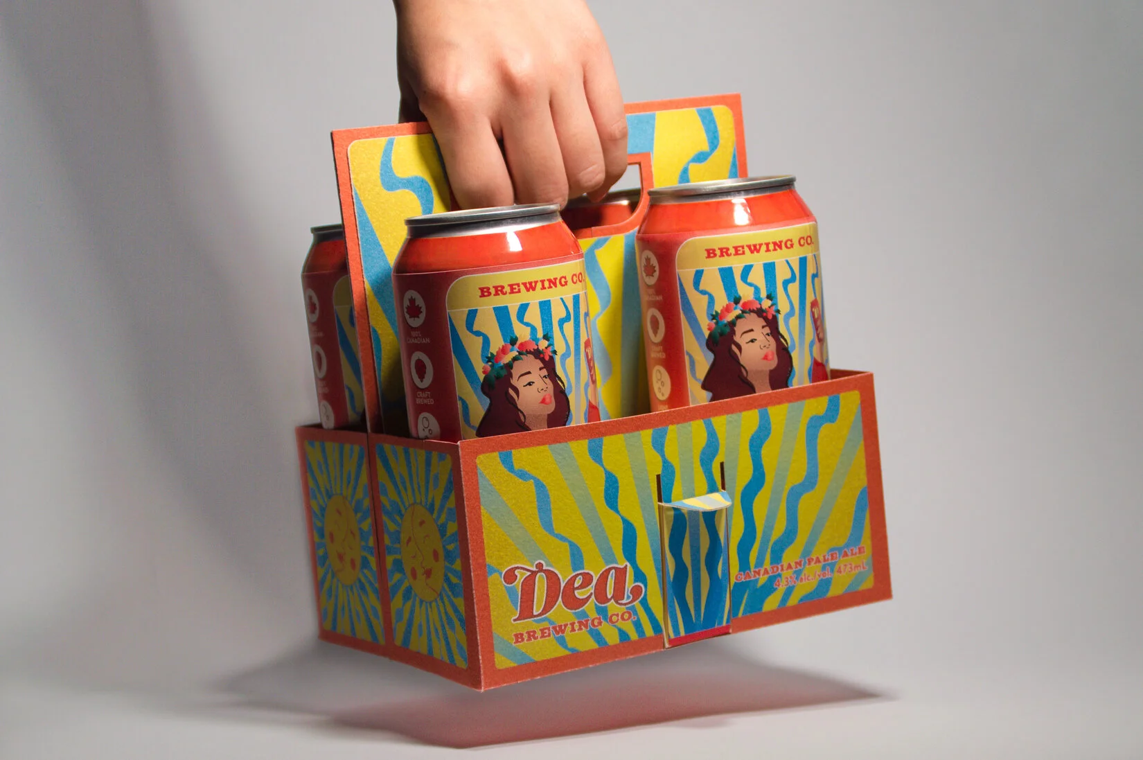
A fictional beer company that offers a fresh, new, and sustainable package design while paying homage to the traditional history of brewing as a woman’s responsibility.
TYPE
Package Design
TIMEFRAME
3 months
ROLES
Research, Illustration, Visual Identity, Physical Prototyping & Construction
TOOLS USED
Illustrator, Laser Cutter, Vinyl Printer
The Problem
Plastic six-pack rings are wasteful and harmful to our wildlife. Beer bag packaging typically have a single life cycle and serve one purpose—to carry their beer cans. Additionally, many mainstream beer companies are targeted towards the male demographic and lack a sense of inclusivity.
Design Challenge
How might we design a beer package that reduces waste, serves more than one purpose, and strives to re-define the typical demographic for beer?
My Solution
Uniting drinking and snacking in one easy-to-use and environmentally-friendly package design—that can be re-used for any carrying purpose. This took the form of Dea Brewing Co., an imaginative beer brand that bridges the gap between function and fun, while pushing to change the visual language and masculine connotations surrounding beer.
Why Dea?
Named after Dea Latis, the Celtic Goddess of Beer, this beverage is an homage to the fact that women have been making and drinking beer for centuries. Dea is primarily targeted for women, but it is truly meant for all drinkers.
Visual Design
The vibrant tarot-card-inspired illustrations invite drinkers to pick up a bag of Dea, as it offers an authentic, contemporary, and playful take on the common beer packaging.
Sustainable Usage
The unique case is recyclable and serves multiple purposes. The case carries four beer cans and two detachable snack mixes. Bring Dea to a party, the ballgame, or anywhere you want to share a drink and snacks with some good company—and don’t forget to refill your Dea bag when you’re all done!
Research
The development of Dea began with competitive market research and a dive into the history of beer to help inform the structure of the package and the brand story.
I found that all bottled beer used paper-based bags, while cans use plastic rings, or paper-based bags with awkward handles. This later influenced my design for a canned-beer bag that is comfortable and sustainable.
Development
The Goddess of Beer motif was used to create a vibrant and radiant personality for the brand. Inspiration came from tarot card designs, their primary colour palette, and the grainy textures. The motif of the tarot card imagines Dea as a persona for the deck, and the wavy lines + sun/moon illustration of the bag accompanies this.


Takeaways
Dea was my first packaging project where I pushed myself to put sustainability at the forefront of the design. The process of creating this package was extensive, especially in the development of the form and the integration of the snack boxes. I thoroughly enjoyed the physical construction of the packaging, the process of iterating and re-iterating to find the best possible solution within the time constraints.
If I were to extend this project further, I would develop a brand that offers different beer flavours and snack types—with each edition using a different tarot card as its persona.

Next Project →


