THE GUGGENHEIM REBRAND
THE GUGGENHEIM REBRAND
Designing a contemporary, expressive and dynamic rebrand for the Guggenheim Museums & Foundation.
This project is not associated with the Guggenheim Museums & Foundation.
TYPE
Branding
TIMEFRAME
3 months
ROLES
Research, Brand Strategy & Identity, Logo Design, Brand Guidelines
The Problem
The Guggenheim Museums & Foundation is a non-profit modern and contemporary art organization with four locations in New York, Venice, Bilbao, and Abu Dhabi.
While the current logo of the Guggenheim Museums & Foundation is strong in its simplicity and memorability, I find that it lacks the individuality and memorability of the museums themselves. Furthermore, there is a need for a fluid and unified identity among the museum locations across the globe.
Design Challenge
How can we re-frame the Guggenheim brand to unify the four museum locations, express a modern yet timeless visual language, and be inclusive of younger audiences?
My Solution
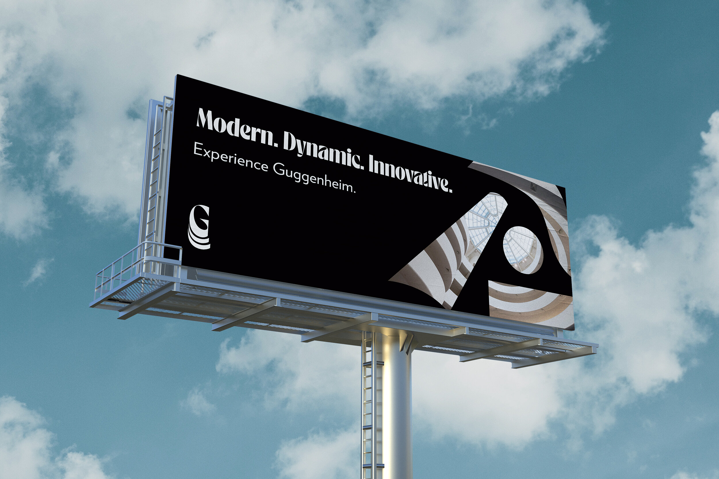
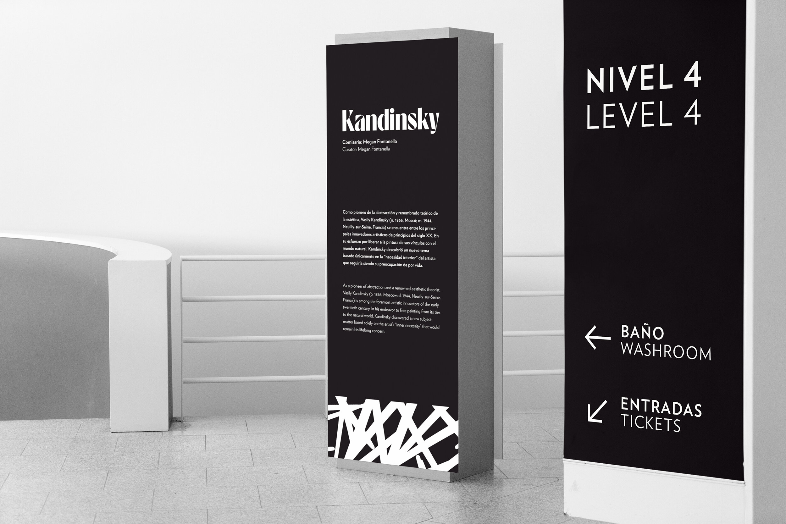
A fluid brand identity that takes inspiration from the memorable architecture of the Guggenheim museums and the contemporary art collections within them.
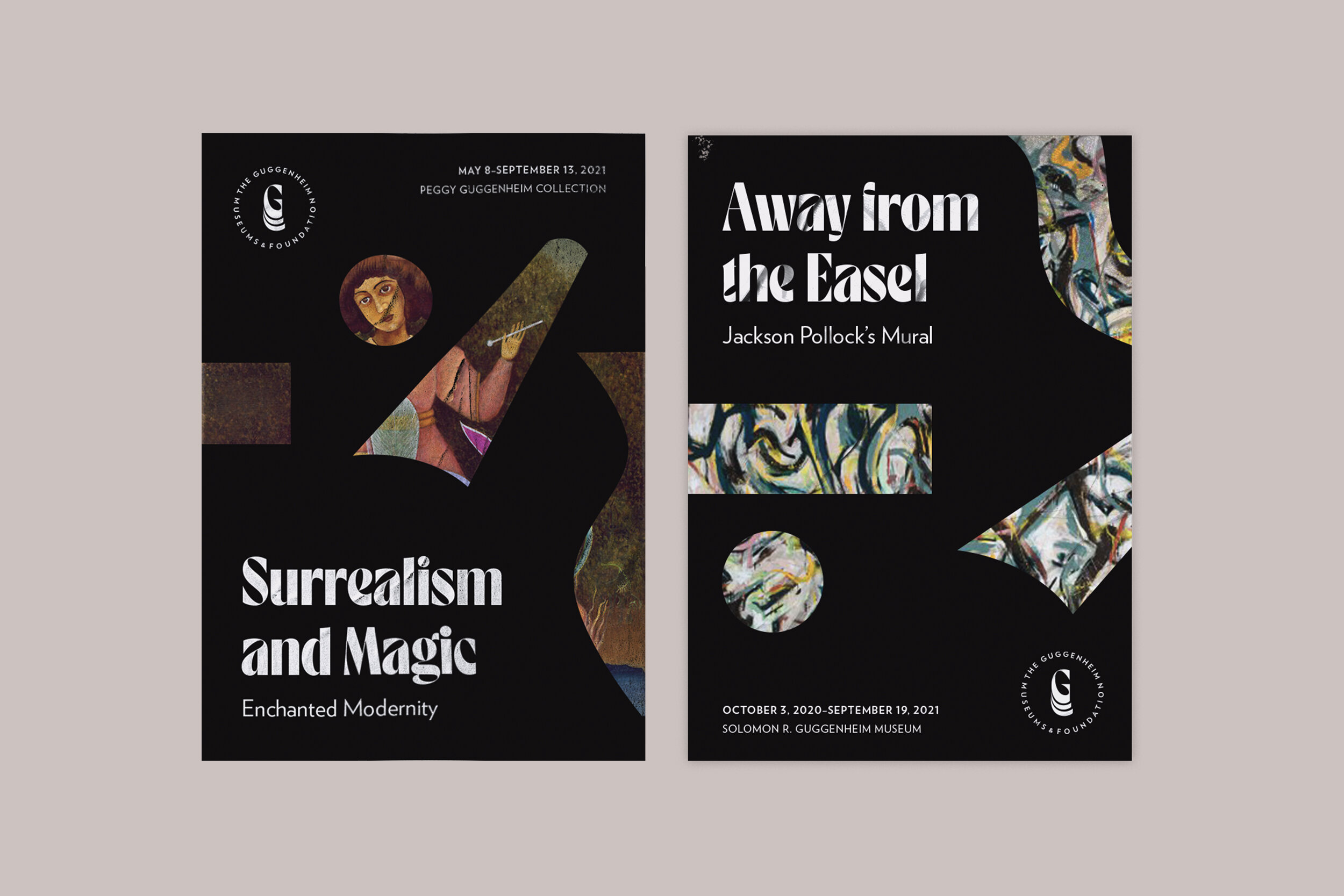

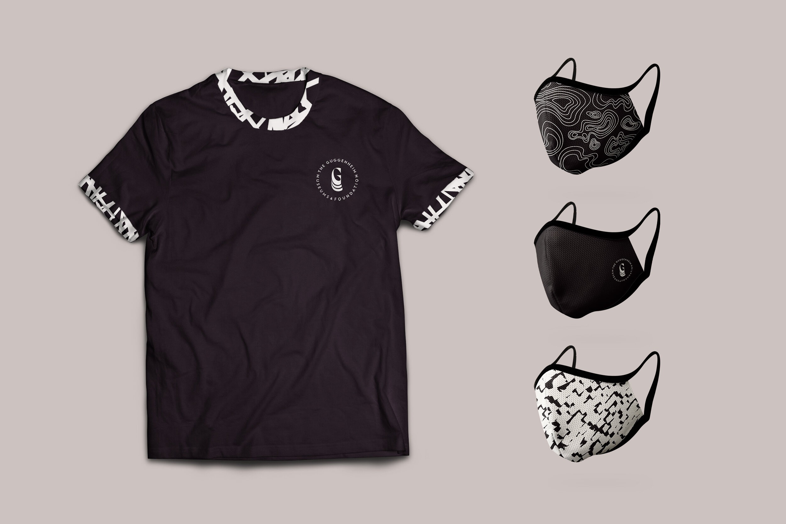
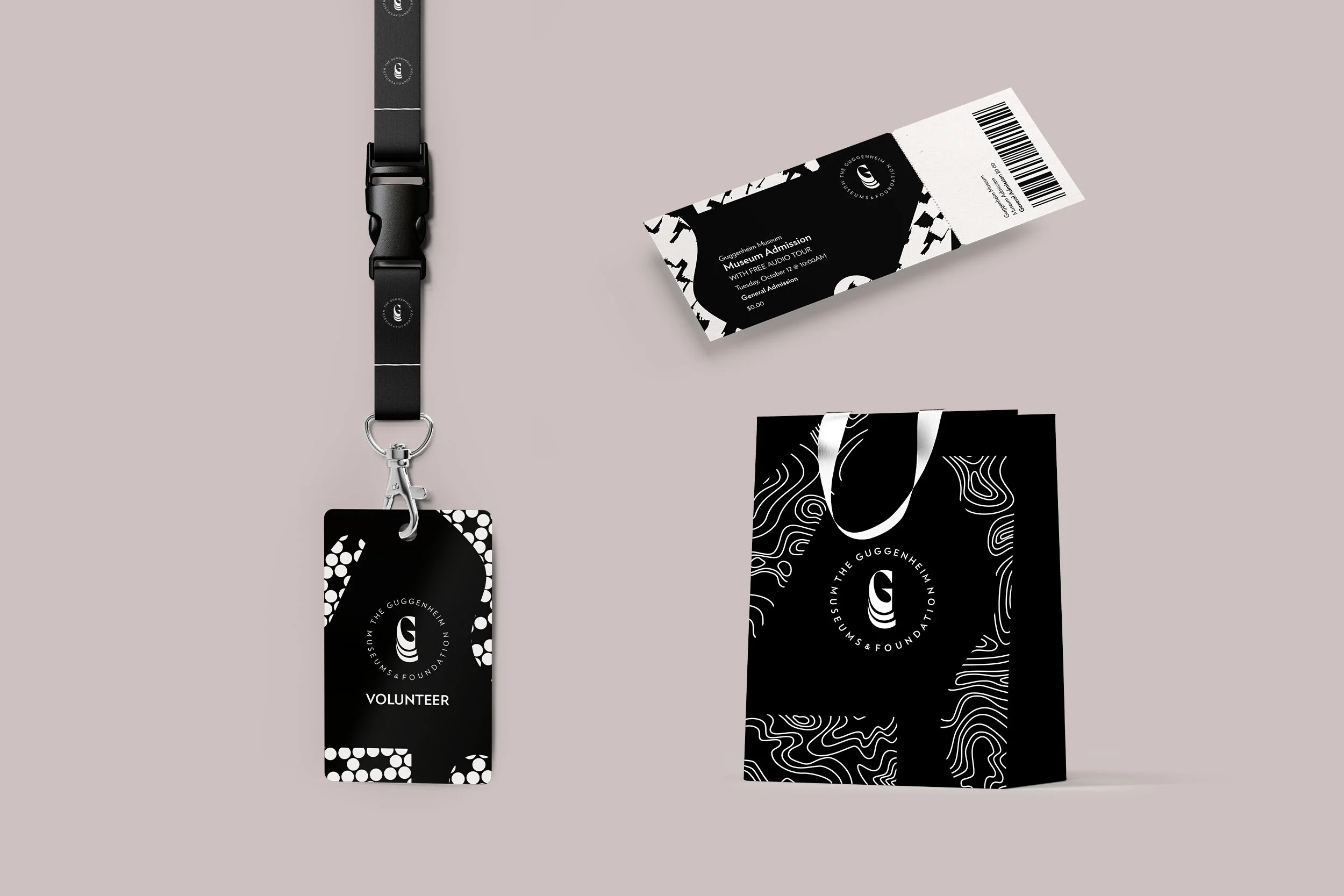
Brand Direction
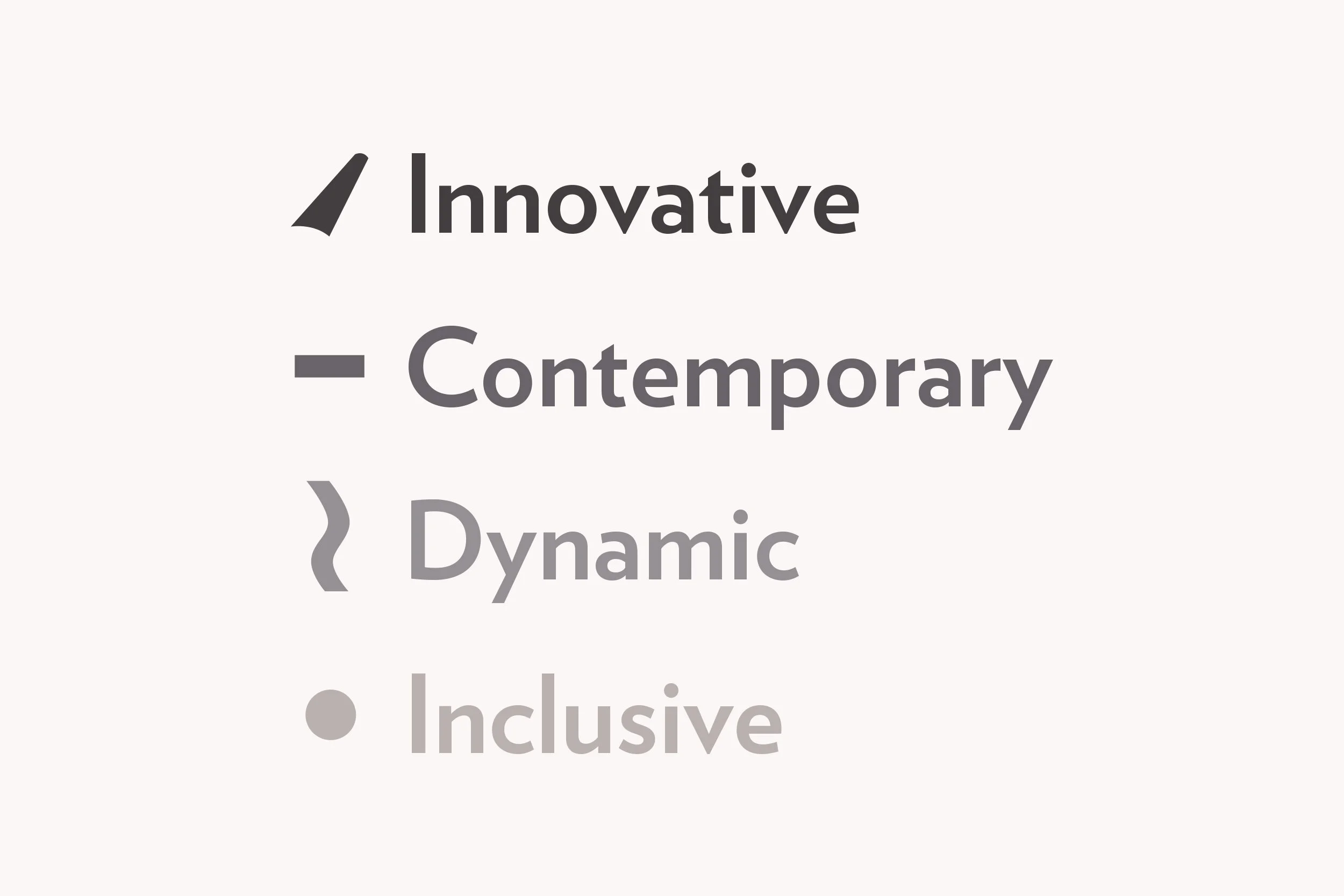
This rebrand aims to position the Guggenheim as an expressive, innovative, and contemporary organization.
Logo
The proposed logo maintains both modernity and traditionality by revitalizing the use of Verlag (a sans serif typeface by Jonathan Hoefler which pays homage to the original signage of the Solomon R. Guggenheim). The curves of the symbol uplift the ‘G’ to a height of modernity and innovation. These curves are inspired by the distinct architecture of the original Solomon R. Guggenheim Museum in New York.
Fluid Elements
The fluid elements draw upon the distinct architecture of the four Guggenheim locations. To celebrate the diversity of the organization, it is important to create four distinct shapes that work cohesively, just like the Guggenheim museums themselves. The fluid patterns used across the brand applications are inspired by four art movements seen within the Guggenheims’ collections: Surrealism, Expressionism, Pop Art, and Impressionism. The artistic fluid elements, expressive typography, and contemporary colour palette aim to unify the brand's identity across all Guggenheim museums.
Logo Rationale
Typography
Brand Principles
Colour Palette
Fluid Shapes
Fluid Patterns


Takeaways
Taking on a well-known organization and attempting to revitalize a brand identity was a very intimidating, but rewarding experience. I learned that the process of rebranding means much more than the final brand collateral—it requires a foundation in a meaningful brand story that will reach wider audiences and ultimately help people align themselves with the brand identity.

Next Project →


